There’s a scene in Harry Potter and the Half-Blood Prince where Harry and his friend Ron arrive late to their first class of the year of Advanced Potion Making. Harry tells Professor Slughorn that they don’t yet have textbooks, so Slughorn sends them into the closet to get some.
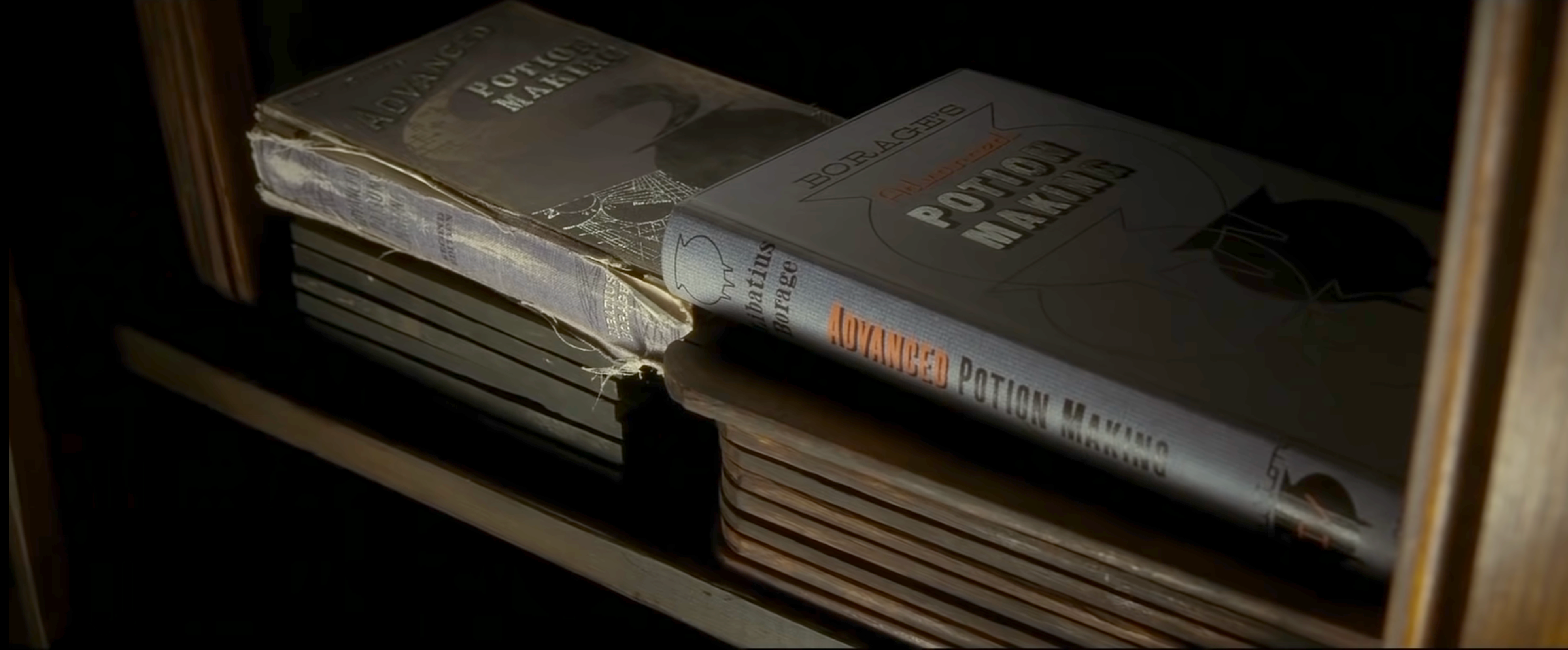
There are 2 books left: a brand new one and an old, beat-up, used one. Ron and Harry fight over it, and Harry gets stuck with the old one.

The first assignment given to the class is to brew an acceptable draft of Living Death, and whomever can do this will win a vial of Liquid Luck as a prize. Slughorn says the recipe for Liquid Luck is found on page 10 of the textbook, but he also warns that only once ever did a student manage to brew a potion of sufficient quality to claim the prize. (Foreshadowing!)
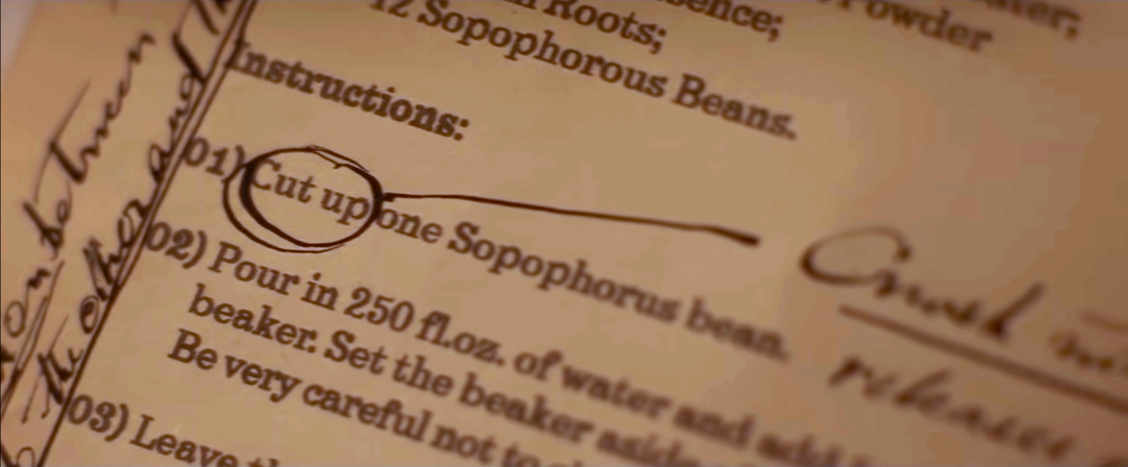
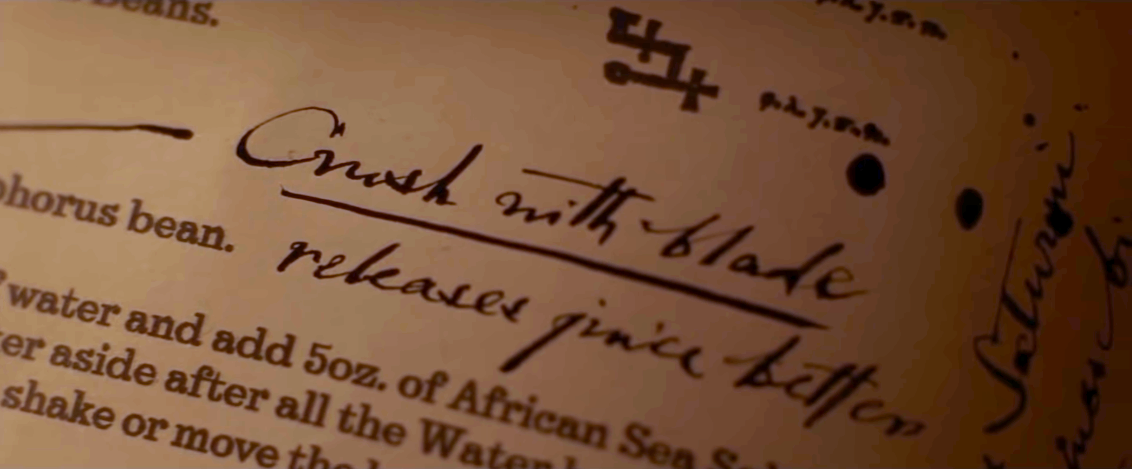
All of the students struggle, but Harry discovers that his old textbook—labelled property of “the Half-Blood Prince”—is full of notes written in the margin that show how to do succesfully brew this potion. The notes share tips like, “Crush with blade” instead of “cut” like the instructions say. Or use 13 beans instead of 12.


With his annotated textbook, Harry’s the only one who manages to make the potion successfully and win the prize. It’s almost like cheating to have someone who’s done it before tell you how to do it successfully.
Many teams approach making a design system like writing a textbook. They write down the ideal way to build a product in theory. They try to guess what would be the perfect Card component for everyone.
But that’s just a spec. It hasn’t really been proven yet. This is why a pilot methodology is so useful. A design system isn’t writing a spec beforehand. It’s doing something successfully, and documenting it afterwards.
Front-end designer Brad Frost says a design system is “the official story of how your organization makes digital products.” Said differently, it’s a collection of stories for how teams at this organization have made digital products that highlights the patterns that emerge from seeing all those stories in one place.
Make a cheat sheet for people who create digital products after you have. Crush; don’t cut. Use 13 beans, not 12. Inline alerts here, not pop-ups. This shade of teal because it has higher contrast against the background. Not because that could work in the future, but because that has worked in the past.
Stop trying to make a design system by making abstract components. Instead, give your team a use case. Pick a potion to brew. Living Death. The main product Dashboard. The Intranet. Put yourself in the shoes of the people trying to use the design system by trying to making something close to what they’d be making. If they need to be making intranets, keep making intranets first to work out the kinks.
Try to follow the textbook, and make notes about where the textbook just isn’t right.
That’s the design system. Not the textbook. The design system is the notes in the margin. That’s what’s been contributed back: the stories, the solutions.
Originally published on Twitter.
Read Next